To display unity using simple shapes, I chose to use 10 ovals. The ovals all touch at least one other oval and were grouped together to form an image of a flower. Their similarity in color, close proximity to one another, and coherence together in producing the flower image allows these ten different shapes to be unified together.
To visually depict "celebration", I used trapezoids. The longer of the two parallel sides is faced upward so that the largest part of each shape is at the top of the graphic. This aspect of the image, along with the long reflection effect is to give the illusion that the trapezoids are jumping, a typical expression of celebration. The different height levels and tilted directions of the shapes allow them to appear as though they are jumping to various heights and angles. They are all grouped in one line because they are celebrating together. Yellow is used as the primary color in the image because it is typically associated with happiness, while the black lines are used to separate the shapes from the yellow glow effect which was utilized to symbolize happiness.
By using shapes to depict the word "isolation", I first grouped nine circles into the form of a square. The are aligned with each other on every side and are neutral in color so they do not stand out, but they do form a coherent mass. The one circle that is far removed from the nine others is the one being isolated. It is given priority by its darker color, also showing it is not like the others. I was also given a pink glow to symbolize some form of shame or embarrassment.
"Escape" was created through the use of 10 outlines of squares. The largest square is black and symbolizes an area of confinement, so its different color and size are used to prioritize it. The rest of the shapes are all smaller and a light red color to symbolize exhaustion through their escape attempts. All of the little square outlines have been rotated to face in a direction away from the area of confinement. They also have a noticeable shadow behind them to give the perception of motion. The four in the larger square outline are still in confinement but are trying to escape, while the other five are "on the run." The bottom of the black square is in alignment with the bottom corners of the lower two "escaping" squares to provide an edge to the graphic.
To display intimidation, I used triangles of different sizes. The first nine were grouped together and stacked to look tall and overwhelming. The last triangle is much smaller, especially when compared to the stack. It was placed in close proximity to the group of triangles to really show the dichotomy between them. The base of the bottom white triangle and the base of the black triangle are aligned so the viewer's eyes are given a clear boundary of where the page ends. I chose to use black and white to relate intimidation back to times of extreme prejudice in the United States against African Americans. This can also be related to how many immigrants from Mexico, South America, and the Middle East currently feel like they are treated when entering and living in the borders of the United States.
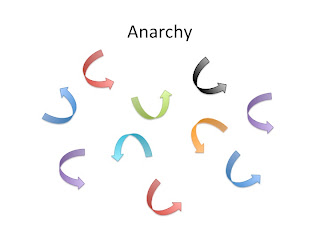
Anarchy is defined as the lack of organization, government, or control. For this reason, I used ten arrows pointing in all different directions. They are not unified by one direction or color, nor can they be easily grouped together in any way. They are randomly placed and colored to show they are without order.
Logic involves deductive reasoning and rational thought. For this reason, to display the word, I made ten triangles into the form of a flow chart. The top four triangles are dark green and beveled to show that they are four distinct categories (these could be ideas or observations). Three slender, light green triangles are rotated downward to look like arrows. These "arrows" show a connection in relationship between the four triangles on top and the three triangles on the bottom. The three triangles on the bottom of the image depict the three solutions or ideas that come from the four distinct categories on top. They are also darker green and beveled to show that they are categories and do not symbolize connections.


No comments:
Post a Comment