 |
| Before |
 | |
| After |
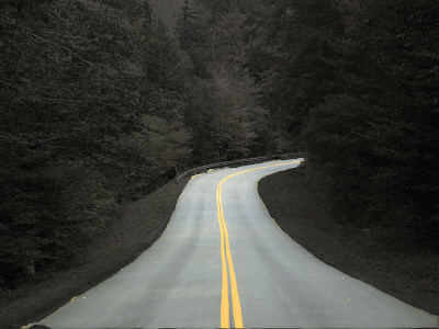
In the first image, the emphasis is placed on the changing trees. The line in the road is not the focus because its color is repeated in some of the foliage. I desired to make the road, especially the middle line, the emphasis of the image through color and making it the one element in the photograph that is focused on above all else. To do this in Photoshop, I lowered the saturation and lightness of the trees/background an extreme amount to make the vibrant colors disappear.
I road was left a light color so that it was differentiated from the background and still connected/grouped with the yellow line, but because it is still on the grey-scale, the line still sticks out the most. In terms of alignment, the line is equal distance from both edges of the road and the curve of the line follows the curve of the road. The color of the central line gives it priority over the other subject matter in the image.
No comments:
Post a Comment