Before
After
For the "Color" image, I altered the colors of a thumbtack to a light green and orange. My goal was to make a thumbtack look more fun/appealing using colors. I chose to lighter tones to make it less threatening and stiff. Since the background is white the color attributes of the image still stand out, although they have a softer color contrast than the original black and white image.
For the "Styles" graphic, I selected the puzzle style from Photoshop. I used this style because it was one of the only choices that allowed the lines of the envelope to still remain visible. Choosing this style allowed the image of an envelope to remain identifiable and central to the image.
For the "Fills/Textures" graphic, I applied the Photoshop "Stained Glass" texture. Lines were determined unnecessary because of the contrast that already exists between the purple check mark and the white background, allowing the shape to be the central focus of the graphic. Using a color scheme within the check could have created a aesthetically pleasing visual once the "Stained Glass" texture was added. Next time when using that effect, I would like to try using various colors in an image and see how it looks.
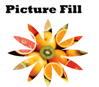
For the picture fill, I wanted to use a shape and photograph to create a image that resembled summer. The citrus fruit paired with the the outline of a flower work together to reflect this theme. In terms of attributes, the lack of a line around the shape allows it to be completely defined by the images of fruit and not by a set line. This definition by the photograph helps reinforce continuity between the design components. The citrus colors work together to complement one another and enhance the theme as well. When observing the picture and shape overlay in Photoshop, the only placement of fruit I really thought would help convey the message was to have a full fruit slice circle in the middle. I chose to use the kiwi because it was the only image of a kiwi in the photograph, so it would stand out as a unique part of the design, thus allowing it to be the center of the flower.


No comments:
Post a Comment